Let’s be honest with ourselves: pop-ups, pop-unders, intrusive Flash advertising, and content-obscuring modal dialogues all suck, both from an aesthetic perspective and for site users.
In modern web design, the trend is towards elegance and simplicity; providing awesome content that’s pleasant to consume is the order of the day. But, we have to make money, and that’s what intrusive advertising is supposed to achieve.
The web is growing up, and part of its developing maturity is that serious sites that want to make money from content – particularly bloggers – are tying to look less like the flyers we find under our windshield wipers advertising quack remedies in garish colors and fonts, and more like credible publications.
A key driver in this trend is the growing prevalence of mobile. What’s annoying on full-size screens is a deal-killer on the small screens of mobile devices. Mobile first design is largely responsible for motivating the move to simpler pages.
Because screen real-estate is scarce, subtle integration of promotional material that doesn’t detract from the overall experience is essential.
CTA
When aesthetic requirements and technological trends clash with opportunities for revenue generation, a fertile ground for innovation opens up. One solution for elegant, prominent calls-to-action is minimalist, non-intrusive, but very noticeable message bars.
You’ve probably noticed notification/message bars popping up on sites. Several companies offer this service. The on-page functionality is basically the same: a simple, modest bar appears across the top or bottom of a site.
It contains a message and a call-to-action. The bar is often sticky, remaining in position as the site scrolls. Most also offer a range of analytics, and some offer split-testing.
If you’re a user of Meebo Bar, you’ll know that it’s being put out to pasture next month. The bars we’re going to take a look at here are a great replacement (if somewhat less functional, but that’s part of the point).

ThreeBar
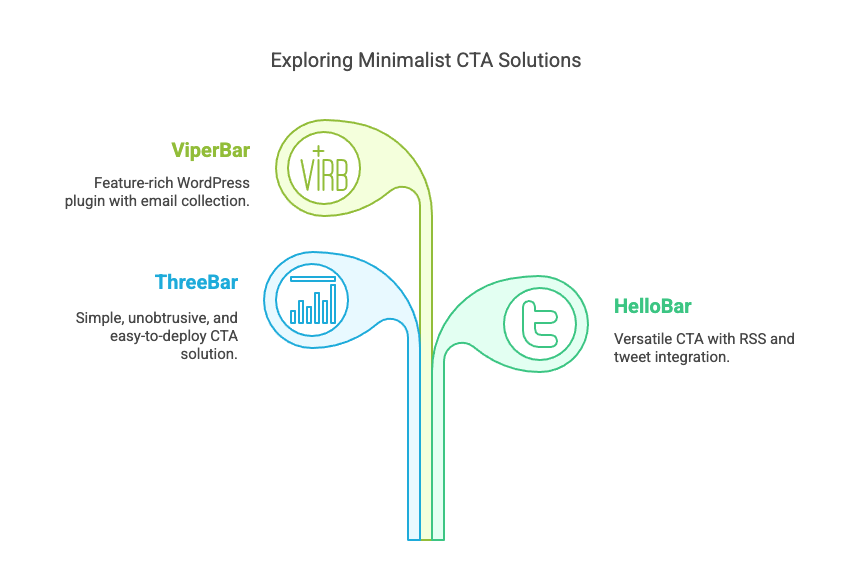
ThreeBar is an unobtrusive implementation that is extremely simple to deploy. To get started, you only need to create an account, customize the bar’s color and font, and add a JavaScript snippet to the page.
ThreeBar also offers analytics, so users can see how their visitors are interacting with the bar and adjust it to optimize conversions.
Each interaction a user makes with the bar counts as a credit. For very simple sites that only need one bar and won’t have more than 1,000 such interactions per month, ThreeBar is free.
The price increases in increments, up to $30 per month for unlimited bars and 100,000 interactions, depending on how many credits and bars a site expects to use.
HelloBar
HelloBar is in many respects similar to ThreeBar, but it has a number of extra functions. If you want simplicity and very easy deployment, ThreeBar is a great choice.
However, if you want to experiment more, look at HelloBar. HelloBar’s ability to pull content from RSS feeds and tweets is one of its best features. This means your HelloBar can display an easily updated roster of content.
ViperBar
ViperBar is a free WordPress plugin that offers more features than the solutions we’ve already looked at, including the ability to include form elements for collecting email addresses, integration with MailChimp, and real-time conversion analytics. If you’re a WordPress user, check it out.
Have you used any of our suggestions or an alternative? What was the impact on your conversion rates? Let us know in the comments below


