A lot of people forget that search engine optimization isn’t simply a matter of finding the right keywords and selecting the right topics. It’s about more than meta descriptions and site content. User experience is every bit as crucial to creating an effective site.
Because if your site doesn’t perform properly—if it’s not fast, intuitive, and easy to navigate—then none of the other stuff matters. People aren’t going to stick around to see your compelling content. They’re going to leave and likely end up navigating straight to one of your competitors.
Make Sure it’s Mobile-Friendly
By 2025, 72.6% of all Internet users will access the web exclusively on their smartphones. By 2030, that number is likely to be significantly higher. At this point, the simple reality is that if your website is not optimized to perform well on smartphones and tablets, you are alienating the majority of your audience.

And when you factor in that mobile-friendliness has been a ranking factor for some years now, you’ll very likely see yourself drop down the rankings of the search engine results page, as well. As for what this involves, you’ll want to do the following:
- Design your layout to be readable on smaller screens.
- Keep the user experience consistent across pages.
- Connect everything to social media where relevant.
- Test your site with Google’s Mobile-Friendly Test Tool.
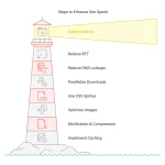
Optimize for Speed
You’ve probably heard the statistics. More than half of people will abandon a website that takes more than three seconds to load, and the majority of people won’t wait longer than six. Guidance from Google reflects this as well, recommending load times of under half a second.
And like mobile-friendliness, speed is also a ranking factor, meaning you’ll want to do the following at the minimum to keep your site loading fast:
- If you must use JavaScript, ensure the code is as light and efficient as possible.
- Compress all images when uploading.
- Utilize browser caching.
- Avoid heavy use of rich media like video.
- If you’re using a tool like WordPress, use a responsive theme.
- Avoid pop-ups.
- Consider enabling Accelerated Mobile Pages.
Structure Things Logically
We’ve all encountered sites that were difficult to navigate.
Nested menus within nested menus, the end result is a confusing, frustrating mess. Links and categories that go in circles are as difficult to follow for humans as it is for search engines. Graphics that could be charitably described as an eyesore.
Your website must be as streamlined as possible, with a sensible hierarchy and an easy path into and out of every single page. Every segment should flow naturally into every other segment, and no page on your site should be more than three jumps away from the homepage.
In Closing
SEO is about more than keywords and content. Design is every bit as important. The best practices here are a good starting point in that regard, but they aren’t everything—the rest is up to you. Want more resources on SEO operations? Check out our resources page!